Typography is more than just arranging text; it’s an essential aspect of web design that significantly impacts user experience. Good web typography ensures that content is not only visually appealing but also easy to read, allowing users to engage with the information effortlessly. Poor typography, on the other hand, can lead to frustration and high bounce rates, hampering the effectiveness of even the most well-designed websites. In the digital age, where users skim rather than read, achieving excellent website readability is paramount. Theme Ignite simplifies the process of achieving top-notch typography, offering customizable themes and fonts designed to enhance readability and aesthetics. By leveraging such solutions, you can ensure your content communicates effectively, leaving a lasting impression. Let’s delve into how understanding and enhancing web typography can elevate your site’s usability and visual appeal.
Principles of Web Typography
Good web typography is built on foundational principles that guide designers in creating text that is not only readable but also engaging. Below are key principles to focus on:
-
Hierarchy
-
Font Sizes: Use large fonts for headings to grab attention and smaller, uniform sizes for body text. A common practice is to set body text at 16-18px for optimal readability.
-
Weights and Styles: Bold or italicize key points to make them stand out. Use heavier weights for headings and lighter weights for secondary text.
-
Color Contrast: Ensure sufficient contrast between the text and background to enhance visibility.
-
Line Spacing (Leading)
-
Proper line spacing improves text readability by making it easier for the eyes to follow lines of text.
-
Aim for a line-height of 1.5 to 2 times the font size.
-
Avoid crowding lines of text, especially in dense paragraphs.
-
Letter Spacing (Tracking) and Word Spacing
-
Adjusting the space between letters and words can significantly improve text clarity.
-
Use tighter spacing for larger text and looser spacing for smaller text.
-
Avoid excessive word spacing, as it can disrupt the flow of reading.
-
Alignment
-
Proper text alignment contributes to a cleaner layout.
-
Left-aligned text is ideal for most websites as it aligns with the natural reading direction in many languages.
-
Avoid fully justified text, which can create uneven spacing.
-
Consistency
-
Maintain consistency across the site in terms of font styles, sizes, and spacing.
-
Use a style guide to ensure uniformity in typography.
-
Stick to a maximum of two to three font families for coherence.
To make implementing these principles even easier, explore the Theme Ignite Premium Products. Offering expertly crafted themes with built-in typography settings, these tools allow you to achieve professional-grade typography effortlessly. Whether you're designing a personal blog or a business website, Theme Ignite’s premium collection ensures your typography is both consistent and visually captivating.
Tips for Selecting Fonts and Creating Harmonious Pairings

Font selection is a critical aspect of web typography. The right fonts can convey your brand’s personality while enhancing website readability. Here are tips to master font selection and pairing:
-
Prioritize Legibility
-
Choose fonts designed for screen use, such as sans-serif fonts like Arial, Roboto, or Open Sans.
-
Avoid overly decorative or script fonts for body text, as they can strain the eyes.
-
Pair Fonts Strategically
-
Contrast but Complement: Pair a sans-serif font for headings with a serif font for body text. For example, use Montserrat (sans-serif) with Georgia (serif).
-
Limit Pairings: Stick to two complementary fonts to avoid a cluttered appearance.
-
Hierarchy Through Pairing: Use one font for headings and another for body text to establish a clear visual hierarchy.
-
Consider Brand Identity
-
Choose fonts that align with your brand’s tone. A corporate site might opt for clean and professional fonts like Helvetica, while a creative portfolio might embrace playful fonts like Lobster.
-
Test fonts in different contexts to ensure they fit your brand’s message.
-
Optimize for Accessibility
-
Ensure fonts are large enough to read across devices. A minimum size of 16px is recommended for body text.
-
Test fonts for readability on various screen sizes and resolutions.
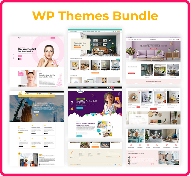
For an effortless way to create cohesive font pairings and a stunning website, explore the Theme Ignite WP Theme Bundle. With a variety of customizable themes designed for readability and aesthetics, this bundle takes the guesswork out of font selection and design. Whether you’re building a corporate website or a creative portfolio, Theme Ignite has the perfect solution to match your style.
Common Mistakes and How to Avoid Them

Mistakes in web typography can detract from the user experience. Below are common pitfalls and strategies to sidestep them:
1. Using Too Many Fonts
Excessive font selection creates a disorganized and unprofessional look.
-
Solution: Limit your design to two or three fonts to maintain consistency and harmony.
2. Ignoring Responsive Typography
What looks good on a desktop may not translate well to mobile devices.
-
Solution: Use scalable units like “em” or “rem” for font sizes, allowing text to adjust dynamically based on the screen size.
3. Insufficient Contrast
Low contrast between text and background can strain users’ eyes, especially in low-light conditions.
-
Solution: Use tools like WebAIM’s contrast checker to ensure sufficient contrast ratios. Stick to dark text on a light background or vice versa.
4. Overcrowded Text
Tight spacing between lines, letters, or words can make content feel cramped.
-
Solution: Use ample white space to give text breathing room and improve readability.
5. Overlooking Accessibility Standards
Fonts that are difficult to read for users with visual impairments can alienate a significant portion of your audience.
-
Solution: Follow WCAG guidelines, such as providing text resizing options and choosing accessible fonts.
6. Misaligned Text
Poor alignment can disrupt the natural reading flow.
-
Solution: Stick to left alignment for most text and avoid centering large blocks of text.
Conclusion
Typography is the cornerstone of effective web design. By mastering web typography, you can ensure that your content communicates clearly and resonates with your audience. From establishing hierarchy and selecting fonts to avoiding common mistakes, every detail matters in enhancing website readability. Investing time and effort into typography creates a user-friendly and aesthetically pleasing website. For those looking to go beyond the basics, Theme Ignite provides expert solutions and personalized guidance to help you achieve exceptional typography and design. Whether you're looking for inspiration, customization, or professional support, Theme Ignite can elevate your website's usability and appeal. Remember, great typography isn’t just about aesthetics; it’s about creating an enjoyable and accessible experience for every user.